Infographics are powerful tools that simplify complex data and present it in an easily digestible format. In the realm of global health trends, utilizing infographics can illuminate critical information, making it accessible to a wider audience. This blog post will guide you through effectively creating infographics that capture the essence of global health trends.
Understanding the Need for Infographics in Global Health Education
Creating infographics for teaching about global health trends can significantly enhance the learning experience. Visual data representation helps learners grasp intricate details quickly, allowing them to focus on critical messages rather than getting lost in text-heavy materials. Moreover, these visuals can be utilized in various settings, from classrooms to online platforms, ensuring that health information reaches diverse audiences.
The Impact of Visual Learning on Health Awareness
Incorporating infographics into health education can foster a deeper understanding of key issues. Visual presentations of data make it easier for individuals to recognize patterns and correlations within health data. By employing engaging visuals, learners are more likely to retain information, making them active participants in their health education journey. This shift can lead to informed discussions and better decision-making regarding health practices.
Ideal Moments for Infographic Use in Health Education
Advantages of Utilizing Infographics in Educating About Health Trends
Using infographics facilitates better communication about complex health data. They allow educators to condense vast information into clear, concise, and meaningful visuals. These tools can aid in bridging gaps in understanding and help demystify global health statistics. Ultimately, well-designed infographics can spark interest and motivate learners to delve further into health topics.
Frequently Asked Questions
Q1: What software can I use to create infographics for teaching?
A1: There are several user-friendly tools available, such as Canva, Piktochart, and EdrawMax, which allow you to create visually appealing infographics with ease.
Q2: How do I choose the right data to include in my infographic?
A2: Focus on the most relevant and impactful data that aligns with your teaching objectives. Ensure the information is recent, credible, and understandable for your target audience.
Q3: Can I incorporate infographics into online learning?
A3: Absolutely! Infographics can be used in presentations, online courses, and social media posts to engage learners and share vital health information effectively.
Q4: What are some best practices for designing effective infographics?
A4: Keep it simple with a clear layout, use contrasting colors, include relevant visuals, and limit text to maintain clarity. Ensure that your message is easily understood at a glance.
How to Create Infographics for Teaching About Global Health Trends
Infographics aimed at educating about global health trends are tailored to engage learners and convey essential data in a visually appealing format. I recall creating an infographic for a community workshop focused on mental health awareness. By using bright colors and clear symbols, I was able to present statistics on mental health disorders and their global impacts effectively.
This experience taught me the value of combining aesthetics with educational content. Each section of the infographic showcased different aspects of mental health statistics, making the information more relatable. As a result, the attendees left informed and inspired to engage in further discussions about mental health resources.
The Importance of Engaging Visuals in Educating about Health Trends
Ultimately, harnessing the power of infographics for teaching about global health trends can lead to enhanced community awareness and participation. By continually exploring innovative ways to present health data visually, educators can drive impactful dialogue and foster a more informed society.
If you are searching about Health Infographics you’ve visit to the right web. We have 10 Pics about Health Infographics like Student-Created Infographics Showcase Wide Range of Global Health, Health Infographics and also Student-Created Infographics Showcase Wide Range of Global Health. Here it is:
Health Infographics
www.animalia-life.club
Infographics
www.cystat.gov.cy
Looking Ahead For Global Health | HuffPost
www.huffingtonpost.com
health global impact infographics ahead looking people michael behance
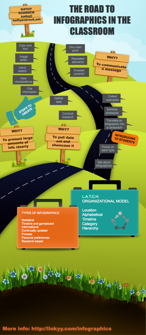
How To Create Infographics For Teaching & Learning – American TESOL
americantesol.com
infographics teaching learning piktochart create infographic tesol american institute road using march classroom education april
Student-Created Infographics Showcase Wide Range Of Global Health
drexel.edu
Medical Infographic Of Health Care Service Stock Vector – Illustration
www.dreamstime.com
statistic cardiology
Global Health Infographics
solherbsrecipe.blogspot.com
health infographics cdc global timeline gov articles
Free Editable Health Infographic Examples | EdrawMax Online
www.edrawmax.com
Teaching Global Health: Dr. Gunisha Kaur | Newsroom | Weill Cornell
news.weill.cornell.edu
kaur dr cornell weill global health torture survivors funded pain research anesthesiology
Teaching Global Health To Undergraduates – YouTube
www.youtube.com
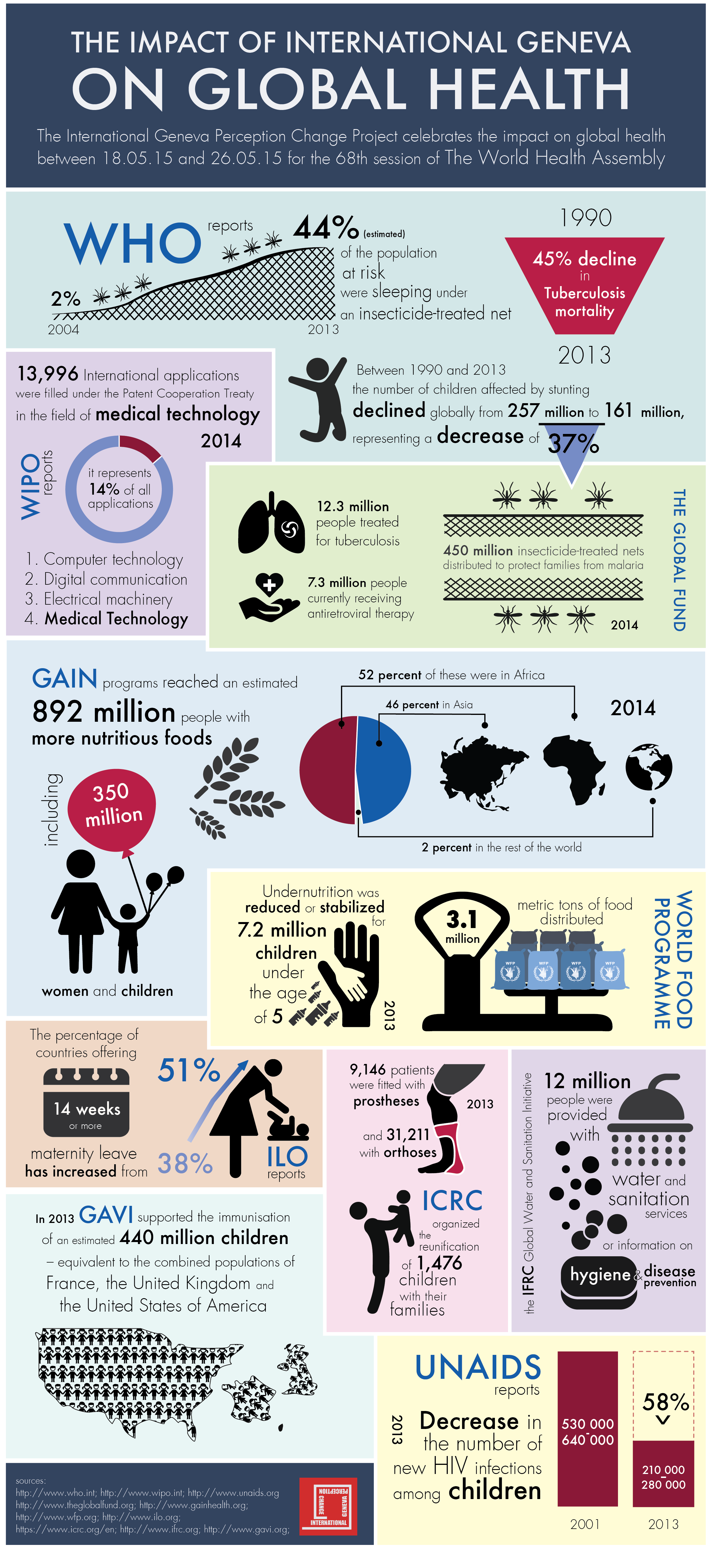
Global health infographics. Infographics teaching learning piktochart create infographic tesol american institute road using march classroom education april. Health infographics cdc global timeline gov articles